Designing Glean for accessibility – focus & shortcuts


Although Glean is just about five years old, our team makes considerable efforts to get things right from the very beginning. It’s helped lend Glean layers of maturity you may not often see in newer products.
One of those layers is accessibility. In line with our mission to democratize knowledge discovery, we’ve made great strides during our journey to make Glean more friendly and usable for everyone. In this blog, we’ll share how we built Glean to be more accessible, along with a few learnings from both a technical and practical perspective.
Guiding principles
Accessibility is a must-have for every product to reach its widest audience. We often receive feedback from customers who want to use Glean effortlessly without a mouse, or understand Glean better when using a screen reader. Accessibility compliance is also a business consideration – it’s a common legal requirement for enterprise customers, and sometimes a last-minute hurdle to closing deals.
Taking these into account, we committed to developing with accessibility in mind and settled on a few guiding principles to set us on our way:
- Consider accessibility at the start of the process – the earlier, the better
- Incorporate a common design system across the product to scale accessibility efficiently
- Get buy-in early from stakeholders, such as product teams and leadership, to align on long-term commitment and resource allocation
With these principles outlined, we moved on to developing our first key improvements for Glean’s keyboard and shortcut experience.
Implementing focus indicators for keyboard-only use
Not everyone can use a mouse – and navigating a product via keyboard closely resembles how a screen reader user accesses the product. Thus, it’s beneficial to make your product work well with a keyboard.
One of the most important functionalities is enabling users to stay in focus. While navigating the website via keyboard, there should always be a focus indicator telling users where their interaction is.
There are a few common ways to implement such focus indicator (also known as a "focus ring"):
<ul type='disc'>
<li> Using popular libraries such as Discord or React-Aria FocusRing, both React-friendly </li>
<li> Or, implementing it yourself. Luckily the web standard has caught up quickly the past few years, making this easier:
<ul type='disc'>
<li> Previously, developers relied on the <span class="text-rich-text-code" style="font-family: monospace;">:focus</span> CSS property </li>
<li> There’s now a widely supported <span class="text-rich-text-code" style="font-family: monospace;">:focus-visible</span> property to detect when an interactive element receives focus and the user agent/browser allows the focus indicator to be visible <ul type='disc'>
<li> For most browsers, this is the equivalent to the interactive element receiving focus via keyboard </li>
<li> Alternatively, you can use a polyfill to mirror this behavior, for more flexibility </li>
</ul>
</li>
<li> To style the indicator itself, you can use common CSS properties such as <span class="text-rich-text-code" style="font-family: monospace;">outline</span> (default behavior), <span class="text-rich-text-code" style="font-family: monospace;">border</span>, or <span class="text-rich-text-code" style="font-family: monospace;">box-shadow</span> <ul type='disc'>
<li> You can also use pseudo-selectors like <span class="text-rich-text-code" style="font-family: monospace;">::before</span> and <span class="text-rich-text-code" style="font-family: monospace;">::after</span> to avoid any potential layout conflict (i.e with <span class="text-rich-text-code" style="font-family: monospace;">padding</span> or <span class="text-rich-text-code" style="font-family: monospace;">margin</span>), which could happen with the aforementioned properties </li>
</ul>
</li>
</ul>
</li>
</ul>
Aside from having a focus indicator that works with keyboard shortcuts (more in the latter section), there are other common focus best-practices that we’ve implemented:
<ul type='disc'>
<li> Having a skip link to immediately bring focus to the main content is very helpful, especially if your site has a verbose header & navigation system </li>
<li> Keep focus order intuitively, meaning:
<ul type='disc'>
<li> Keep your <span class="text-rich-text-code" style="font-family: monospace;">tabIndex</span> usage simple. It should either be <span class="text-rich-text-code" style="font-family: monospace;">-1</span> or <span class="text-rich-text-code" style="font-family: monospace;">0</span>. A positive value means the element’s focus order might mismatch its visual order (i.e a button might be focused before its prior sibling) </li>
</ul>
</li>
<li> Make sure focus is intuitively tracked when traversing across different UI layers:
<ul type='disc'>
<li> For example, when selecting a button that opens up a dialog, focus should be placed to the first interactive element within the dialog. Closing the dialog later would restore focus to its trigger – the previous button </li>
</ul>
</li>
<li> Keep <span class="text-rich-text-code" style="font-family: monospace;">autofocus</span> to a minimum:
<ul type='disc'>
<li> <span class="text-rich-text-code" style="font-family: monospace;">autofocus</span> is a useful tool to place user to where they should be </li>
<li> However, it also causes user to skip over many potentially important information prior </li>
<li> Potential conflict with other autofocus elements can arise </li>
<li> Instead of allowing a primitive/simple element (such as an <span class="text-rich-text-code" style="font-family: monospace;">input</span>) to autofocus, keep that logic as high-level as possible, i.e the page where the <span class="text-rich-text-code" style="font-family: monospace;">input</span> is displayed </li>
</ul>
</li>
</ul>
Life is easier with shortcuts
As mentioned earlier, keyboard shortcuts simulate how a screen reader user navigates the site. Power users also rely on shortcuts to make themselves more productive. It’s an excellent way to help all sorts of users access the product in the way they want.
- In every website, you can use the [Tab] key to move focus around (which should work in tandem with the focus indicator). Focus order should resemble the interactive elements order within the DOM tree (and depends on <span class="text-rich-text-code" style="font-family: monospace;">tabIndex</span>)
- Since using [Tab] is the comprehensive but exhaustive method to navigate through the site, there are a few common patterns to make navigation faster and more intuitive. One of these is via the arrow keys. This method is the most common way to navigate every website, i.e for menu navigation, or adjacent items within a list
- Arrow keys can also be used to cycle between search results or tables
There’s a few other shortcut recommendations to consider:
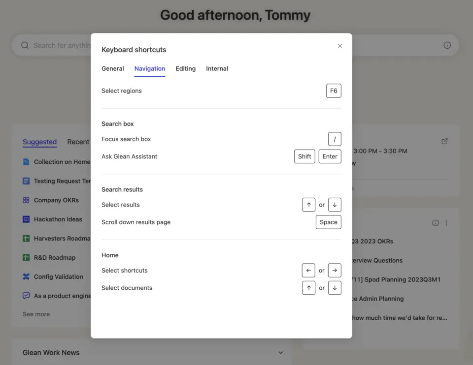
- If your website comprises of multiple important sections (such as sidebar, header, main content, footer, etc...), it’s worthwhile to add a global shortcut to cycle through these regions & allow accessing relevant content much faster. We pick F6 (and Shift + F6 for the other direction) for this purpose
- Users should be able to use any arrow keys for two-dimension navigation across complex structures, such as tables.
- Last but not least, documenting these keyboard shortcuts within the site makes it much more friendly for new users to learn. Within Glean, users can use Command + ‘/’ anywhere to retrieve a list of our supported shortcuts
Accessibility is a journey
Building a product from scratch always has its challenges, but it’s incredibly rewarding to try do it right the first time around. Optimizing the keyboard experience and integrating shortcuts is only part of our accessibility suite and pipeline – as we continue to build Glean, we’re committed to being compliant with WCAG 2.1 AA standards. If you’re interested to learn more, stay tuned for part two of our accessibility blog series!
Have any inquiries or requests when it comes to accessibility? Please reach out to a11y@glean.com – and check out our public accessibility roadmap to know what we’re actively working on to bring better search and knowledge discovery into the hands of more users.
Related articles